
ROLE
Product Designer
TIMELINE
2022 • 3 months
RESPONSIBILITY
Design System
Overview
Designing with a dreadful, outdated Design System is a complete nightmare. It kills the collaboration, increases the time that is spent on a project, and creates a lot of headaches and unnecessary conversations between designers, developer teams and the project managers.
And if somebody is jumping from one project to another, how could they navigate themselves between these old systems? It's the same as an old computer – it was good once, but there are better options after the technical product progress.
Problem Space
After talking with designers, developers and project managers for a couple of hours, their messages were loud and clear. The pain points came from different angles and showed a bigger picture about our in-house work-style.

Defining Pain Points
After talking with designers, developers and project managers for a couple of hours, I could see what are the main issues that they faced within their day to day work. The pain points came from different angles and showed a bigger picture about our in-house work-style.
Our challenge was really simple: How could we design features that improve the complex accessibility that boosts the overall experience?
A few of them don't follow the latest technologies and methods, so they should be educated how they could work more effectively.
Some people mentioned they don't have the complex knowledge to create a well-organised, adaptive file from scratch.
Everybody works with a different kind of method, so we didn’t have an integrated perspective and the same naming conventions.
The progress is not visible for the teams. They want to know which elements are ready to be developed and which are still in progress.
The developers would love to see a followable document about the changes, because it happens quite often that we alter a specific screen.
Principles of the Design System
Creating a design system for a unique product can be a little bit easier if we are going to know where it will be used. It has been created once and the people have been using it for years. In this case, it is different, so the principles is set to support this way.
Customizable
The design system can't limit anyone in their creative freedom.
Up-to-date
It follows the latest technologies and needs to be easy to update.
Collaborative
It creates a connection between designers, project managers and developers.
Well-documented
It offers well-documented change logs, components, interactions.
Problem Space
After talking with designers, developers and project managers for a couple of hours, their messages were loud and clear. The pain points came from different angles and showed a bigger picture about our in-house work-style.
FOR DESIGNERS
Customizable in Seconds
The Design System is already set up with plenty of color, typography and effects styles. It’s super easy to customize the library for different projects.
To make this happen, I used a similar system to the tokenism, but to make sure, that the designers don't feel themselves limited and have all the creative freedom to design a product from sketch. For example, Supercharge often uses custom-shaped shadows under containers so I couldn't extend the token methodology to every foundations.


FOR DESIGNERS
Work Smarter, not Harder
Every single component is crafted with the latest technologies, such as flexible Auto-Layout, easily changeable Variants and Component Properties. Switching, swapping or editing content has never been this easy.
I created as much states, sizes and types as I could, no matter what kind of platform are we talking about. Reflecting on the lack of time, the people can save a lot of days during the configuration if everything is prepared. Later, when I started to monitorize how the designers use the design system in real projects, I had to discover that we could reduce the time in this phase of the project by 60%. In this way, we also reduces the clients' coast which was spent on creating UI libraries.


FOR DEVELOPERS
Changes are not going to be Frustrating Anymore.
Creating an internal UI/UX changelog was a huge step to improve our designer and developer collaboration. This feature was born at a workshop between the tech leads and us. We immediately felt how the brainstorming get us together and helped us understand each other’s perspectives better.
Our changelog is pretty similar to what the devs call a changelog. On this page, the designers can write what kind of changes they made and they can link the components or the specific screen to this modification. This way, the developers don't need to look for unique cases among thousands, because they can access the changes with one click.

FOR DEVELOPERS
Circumstantially Documented
The whole file and the specific components got detailed descriptions. Based on those the developer teams will be able to create the components faster than before because they can see all of the possible cases in one certain place.
The measurement units not only in pixels, but I included a guide to the devs in .rem and .em as well. However, using rem is really basic it wasn’t the standard within the company. The designers have the availability to create multiple types of guidelines for the developers and in this way, we can reduce the unnecessary conversions between them.

FOR PROJECT MANAGERS
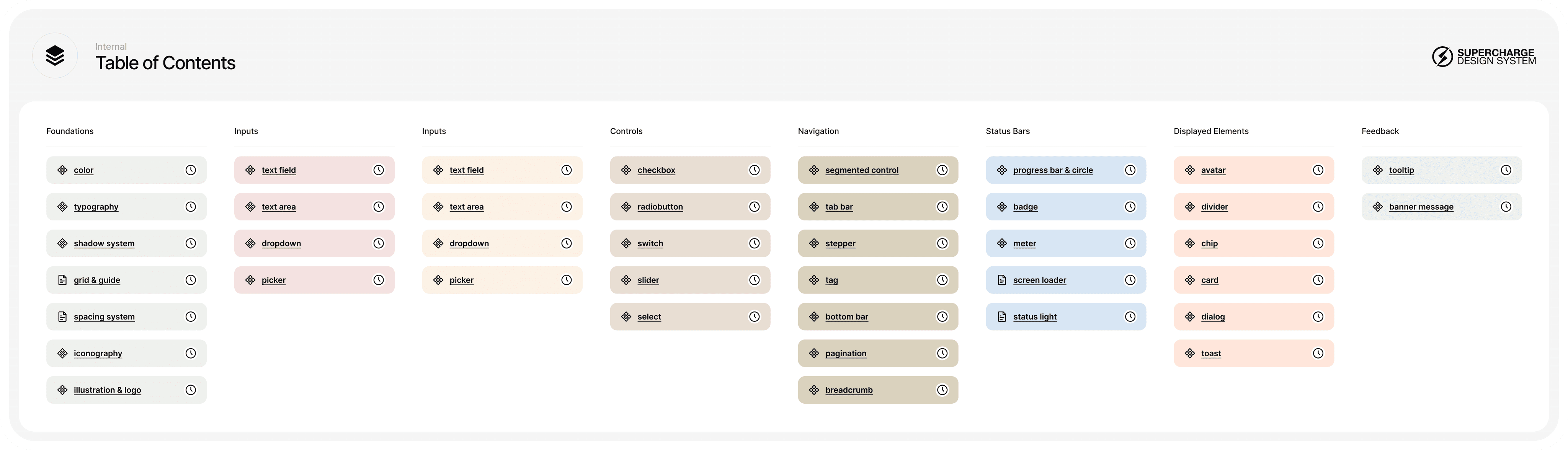
More Predictable, and easy to Track in One Place
The table of contents has appeared which is the list of the components and how they proceed. The project managers can see through what components are ready to be developed and what are in progress, so the calculation of the timeline went easier.
The designers can change the component status from work in progress to ready or even blocked if something is missing. Of course, every component is linked to this table, so everybody can find what they need.
FOR THE TEAM
Ready or Not? Here I come!
Multiple types of badges can indicate which type of component or flow is ready for development, or which one is in progress. In this way, the teams can make an accurate estimation of their internal timeline. Badges are useful between designer who are working on the same project, between the clients and the whole team.

The Outcome & The Takeaways
The feedback on the new design system was fascinating. We can finally reduce the time that is spent on building a design system by 60%. Everybody was amazed, they said to me it’s an absolute quality and an easy tool for them all.
I had the chance to facilitate a 4 times workshop sessions about this whole new system and had the opportunity to present the latest technologies and methodologies to my colleagues. They were thankful and gave me positive feedback. We started to implement this system in April, and the collaboration went smoother and the speed of delivery went faster. Our junior colleagues could also improve a lot in the technical part of the design.