
ROLE
Product Designer
TIMELINE
RESPONSIBILITY
Overview
There are many streaming platforms all around the world, but most of them are always focused on quantity over quality. They would like to present a sense of endlessness when it comes to the number of contents. The users are monitored based on their content choices, then the platform puts those in front of them.
This only covers a small percentage of the users’ needs as there are a lot of emotional contexts and real-life scenarios behind these content choices. The most popular streaming platforms put as much content on one page as they can, and don't realize that the users are not the same. Every service should stick with the most important recognition: there are different people, with different habits.
Problem Space
We didn’t start from zero: OSN operated a working product with full insights and feedback from the users. So firstly, we had to reconsider the product from a bird-eye view.
A lot of user interviews showed a clear result: The screen is overcrowded and users started to suffer from choice paralysis*.
*Choice paralysis is a common challenge that can result from the combination of being overloaded with options, increasing workloads, added daily stressors, and the natural human desire to make the best choices and offer only our best work.

People started to getting frustrated, because OSN gave a lot of options in front of them. In a single viewport, most of the users could see even more than 32 contents. As we dig deeper into this topic, we realized that everybody in the world suffering from the paradox of choice and instead of trying to choose, they are leaving the product.

Opportunities
Putting people first doesn't mean we want to lose money on the other side, so defining our opportunities way a key for both sides.
What if users can choose by their own lifestyles and habits, even if they are pretty different from each other?
What if OSN maximise the amount of content while making the choosing process easier?
What if the platform specifically reflect to cultural constraints that people are facing in the MENA region, such as language barriers?
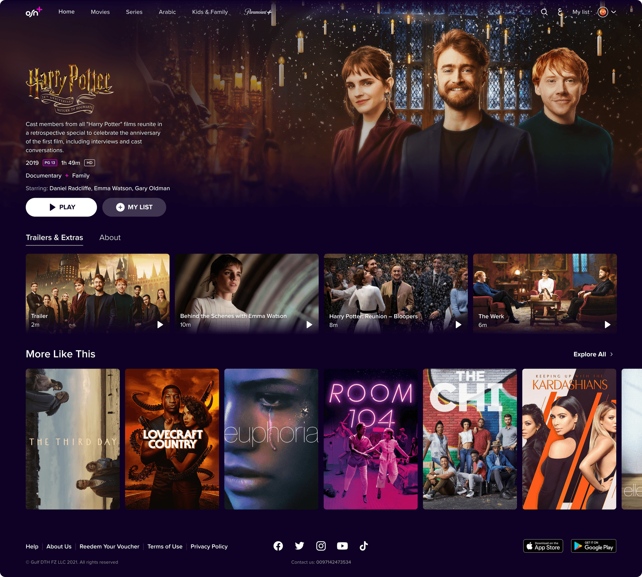
Reimagining the Heart of the Poduct: Trays
OSN operated with a variety of landscape and portrait content trays from 4 to 8 contents in each viewport row. The biggest impact was from our research that the human brain can choose between 4 or 6 contents in a row. We completely redesigned the trays and defined the maximum number of contents in each row to 6 contents. We also built a couple of new tray types to create a more exciting, catchy, explorer experience that helps OSN to highlight contents as well.
Hover Preview
The hover preview of content has a huge role in being chosen by the users. We could see all around the world, from Netflix, and Disney to Youtube – everybody needs and uses hover preview to make sure they will not be fooled by a bad choice.
For the first time, we built a really minimalistic way to check how the users resonate with this type of hover preview. Under the video preview, we just highlighted some metadata, such as genre, keywords*, when the content was made, how long the content is, resolution, sound, and parental guidance.
*Keywords in this case are pretty important from the user's and the creator's perspective as well. It helps the creators to sell a feeling to the viewers what kind of characteristics that content has. It also helps the users to make their choices even faster on their feeling because e.g. a docuseries can be inspiring or even dark. The research showed us that most people can't know what a genre is or what a keyword is so the best way to show it if we put next to the genre.

The most important controls right in front of the users.
The user immediately can see useful informations on their hover previews.
It can’t solve the language barriers: users can’t see what kind of languages do the content available (specifically, if the content is available in Arabic language or not).

Snapshots – Contents based on Real-Life Scenarios
As a designer, I always asked myself: Who wants to read walls of text to choose one content? This type of behavior originates in emotional and real-life contexts. Let's see some of them:
As a viewer, I would like to watch an entertaining, hilarious sitcom in the evening.
As a viewer, I would like to watch a fun movie with my children.
As a viewer, I would like to watch an action film with my partner.
As a viewer, I would like to watch a docuseries under 60 minutes.
We can easily see that people have different habits and our streaming platform should adapt to all of them.

We set up categories that are contextual, and reflect a given mood or watching context. When the user clicks on a bubble, short preview videos are played automatically one after the other in a similar style to Instagram Stories or TikTok Videos. Each bubble in the tray contains 3-6 short preview videos (Snapshots) of a category.

Users can choose to watch the full program right away, add to their list or get more information. Of course, after a preview is over, the next snapshot automatically loads, but users can also skip that manually.
In the end, users are prompted to choose content, they can replay the snapshots, or go back to browse for more content.

Complex Experience for All Screen Sizes
The User Experience should be the same no matter what screen size the users use, so we build OSN completely responsive and adaptive. In this way, everybody can enjoy the same experiences and functions.
We created a system so not all of the information show up on the different breakpoint in this way to the main point of the page will be the screen and the additional infos will show up as we see the page on bigger screens.
The information as well as the contents ratio will remain the same which was a crucial point because we should stick with the 16:9 ratio for all of the covers.


The Outcome & The Takeaways
It was an excellent opportunity for me to work in a robust industry, and learn these kinds of user behaviors in this area. This project allowed me to experience the best ways to build a cross-platform experience for users. I personally loved this project because we immediately got feedback on our design decisions from the users and we could improve the experience more and more. I honestly believe I can use these experiences in the future to help users and create something wonderful.